For three years now, I have been writing very detailed, technical blog posts about the technical minutae of Canadian stamps and postal history. My readers have been enthralled with the detailed information in these posts. However, for a long time I have felt that something is missing: there needs to be a blog where you can come and look at the beautiful stamps. As I say in my tagline above, these are not necessarily the rare or expensive stamps. Rather, they are those stamps that inspire you to want to collect, and they are the stamps that remind you of why you are interested in stamps in the first place.
As a full time stamp dealer, I list a lot of material each week. Each time I do, I come across stamps of such beauty that I feel they should be recorded somewhere permanent. So I came up with an idea: Each week, as I post stamps to my website, I will prepare a post showcasing those stamps that I consider to be the most beautiful examples of art. Each week will feature an eclectic mix and I will attempt to relay some trivia about the stamps as well.
So without further ado, I bring you my very first selection.
The first three stamps are not really stamps at all, but proofs of stamps. Proofs are essentially drafts of the stamps to be issued that are printed and circulated for approval prior to the issuance of the stamps. They are also produced for archival purposes. The proofs that I show you here are not proofs of postage stamps, but rather of Law Stamps. Law Stamps are stamps that were intended to be affixed to any legal document in respect of which a filing or processing fee was to be paid to the government. So, documents like wills, leases, contracts and the like would have fees associated with them, and these stamps would be attached to the documents to serve as evidence that the required fees were paid.
Both Ontario and Quebec issued these amazingly beautiful stamps in 1864 which featured an allegorical figure of "justice" holding scales and a very ornate frameline which consisted of scallops within which the words of the inscription are contained. These are some of the best examples of engraver's art from this period that there is. They were printed by the American Bank Note Company in New York, and there were 15 basic denominations from the 5c to $5 that bore different coloured overprints, to form a set of 45 different stamps for Ontario, and 14 for Quebec.


The stamp shown here is the 75c deep lilac. Note the interesting pairing of the sans-serif numerals with the ornate scrolls and pearls in the side frames.
The next two stamps are much simpler designs and are also revenue stamps. These are the consular fee stamps that were used on passports between 1949 and 1971. There were 5 denominations issued from 25c to $5, and they feature the numerals of value against a large maple leaf, which itself is placed on a cross-hatched background. The frame ornamentation is simple, being very similar to the Postes-Postage stamp issue that was released in late 1949. I like the large maple leaf, the lettering of the inscriptions and the colours.

Here is a beautiful example of the 25c blue. This is the scarcest stamp of the set, presumably because the passport fee did not remain at 25c for very long.


As a full time stamp dealer, I list a lot of material each week. Each time I do, I come across stamps of such beauty that I feel they should be recorded somewhere permanent. So I came up with an idea: Each week, as I post stamps to my website, I will prepare a post showcasing those stamps that I consider to be the most beautiful examples of art. Each week will feature an eclectic mix and I will attempt to relay some trivia about the stamps as well.
So without further ado, I bring you my very first selection.
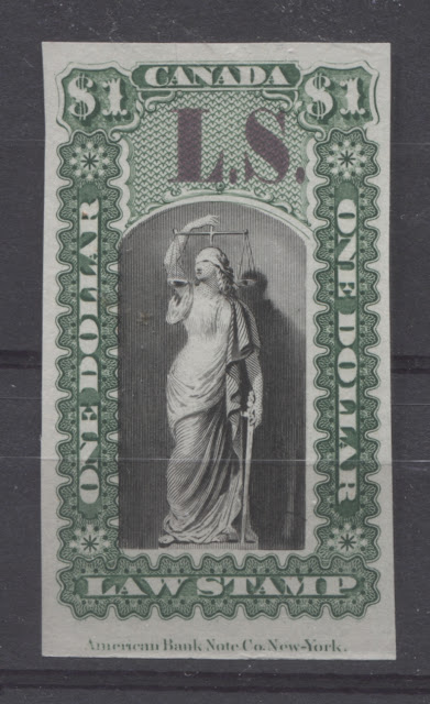
The first three stamps are not really stamps at all, but proofs of stamps. Proofs are essentially drafts of the stamps to be issued that are printed and circulated for approval prior to the issuance of the stamps. They are also produced for archival purposes. The proofs that I show you here are not proofs of postage stamps, but rather of Law Stamps. Law Stamps are stamps that were intended to be affixed to any legal document in respect of which a filing or processing fee was to be paid to the government. So, documents like wills, leases, contracts and the like would have fees associated with them, and these stamps would be attached to the documents to serve as evidence that the required fees were paid.
Both Ontario and Quebec issued these amazingly beautiful stamps in 1864 which featured an allegorical figure of "justice" holding scales and a very ornate frameline which consisted of scallops within which the words of the inscription are contained. These are some of the best examples of engraver's art from this period that there is. They were printed by the American Bank Note Company in New York, and there were 15 basic denominations from the 5c to $5 that bore different coloured overprints, to form a set of 45 different stamps for Ontario, and 14 for Quebec.

This is the $1 green and black with the lilac LS overprint, which stood for Law Society. All of the denominations over $1 were black and green in colour and looked just like this.

Here is the 90c denomination with no overprint. These stamps were never issued in this form - they always had an overprint that was either C.F. (Consolidated Fund), F.F. (Fee Fund) or L.S. (Law Society).

Here is the 40c denomination showing the yellow Fee Fund overprint, and the full American Bank Note Company imprint at right.

Here is a trial colour proof for the Quebec 5c stamp. All the Quebec Issues had an L.C. overprint, which of course stood for "Lower Canada", which is what Quebec was called prior to confederation. What is interesting though about this is that these stamps were never issued in blue. They were green or green and black, just like the stamps for Ontario.

Here is the $2 green and black with the Consolidated Fund overprint in dark blue.
The next stamp is another revenue stamp and comes from the 1932-48 Postal Note and Postal Scrip series. This was a federal issue of stamps that was produced for use on money orders. There were 22 denominations from the 1c to 90c. They are basic numeric designs that incorporate all the usual scroll work and ornamentation that was characteristic of the stamps issued during this period. However, the engraving and design are so well executed in my opinion that when coupled with the rich, vibrant colours, results in a surprisingly beautiful set of stamps.

The stamp shown here is the 75c deep lilac. Note the interesting pairing of the sans-serif numerals with the ornate scrolls and pearls in the side frames.
The next two stamps are much simpler designs and are also revenue stamps. These are the consular fee stamps that were used on passports between 1949 and 1971. There were 5 denominations issued from 25c to $5, and they feature the numerals of value against a large maple leaf, which itself is placed on a cross-hatched background. The frame ornamentation is simple, being very similar to the Postes-Postage stamp issue that was released in late 1949. I like the large maple leaf, the lettering of the inscriptions and the colours.

Here is a beautiful example of the 25c blue. This is the scarcest stamp of the set, presumably because the passport fee did not remain at 25c for very long.

Here is a really nice mint NH example of the $2 violet brown.
The last five stamps from this week's selection all hail from Newfoundland. Newfoundland is one of my favourite areas to collect, as almost all of their stamps were engraved and all were very attractive examples of engraver's art.

This is the 8 pence rose Heraldic Flowers stamp that was issued in November 1861. The colour is a little pale, but look at the engine turning in the oval. That is quintessential Perkins Bacon engraving from that time period.

Here is a really nice mint example of the 5d crown and heraldic flowers stamp from the same set, printed in a reddish brown colour. These crown and flowers designs were also issued by New Brunswick and Nova Scotia, and are among my favourite stamps of all time. Unfortunately most of them, except for a few from Newfoundland are extremely expensive. However, the exquisite detail of the designs is unmatched by all but a very few issues from this time.
The next stamp is one of my favourite Newfoundland stamps. It comes from what collectors usually know to be the "Second Cents Issue". The designation comes from the curious fact that Scott, and Unitrade take stamps issued between 1865 and 1896 and split them into three sets, each of which has stamps issued in the 1890's included, rather than presenting them as three sets confined to each period. This stamp, issued in 1894 is included as part of the second set, whose first stamps were issued in 1868. Most stamps of this series consisted either of portraits of Queen Victoria, the Prince of Wales (who later became Edward VII), codfish, the harp seal and the Newfoundland dog. This stamp is, in my opinion the most attractive of the stamps depicting Queen Victoria:

The detail in that frame is hard to beat, and the rich carmine-lake colour is just superb.
The next stamp up is from the Royal Family Issue, which is another American Bank Note Company creation, that first appeared in 1898. The level of ornamentation on these stamps varied quite a bit, with the 1c and 2c stamps being quite plain. However, the 1/2c, 3c and 5c stamps from this series are very attractive examples of engraver's art.

The 5c steel blue King George V stamp from the set. It should be noted that at the time this stamp was issued, he was actually called the Duke of York, which is the title given to the male heir who is next in line after the Prince of Wales. This stamp comes in a range of different shades of blue, as there were several printings between 1899, when the stamp was first issued, and 1910, when it was replaced by the 5c stamp from the John Guy Issue.
The last stamp for this week comes from the engraved version of the 1910 John Guy Issue. For some unknown reason, the higher values of the 1910 John Guy Issue, which was the only lithographed issue, were re-issued in engraved form in 1911. The printing was carried out by Alexander and Sons, and not De La Rue, as many collectors would expect, given the ubiquitous nature of De La Rue's work in Commonwealth stamps of this period. The 6c though 15c values of the set were all issued as engraved stamps. The number issued is very small - with only 15,000 complete sets being produced back in 1911.
In my opinion, the very nicest stamp from that set is the 12c, which features King Edward VII (after he had been dead for seven months) flanked by a lovely frame of Roman columns

And there you have it! My first selection of beautiful stamps from this fantastic country. Stay tuned for next week's selection.
Comments
Post a Comment